David Carson


In the 1990’s, David Carson set a foundation for all designers and revolutionised the graphic designing scene in America. He is a prominent contemporary graphic designer and art director in today’s society. His work is experimental and vast. In the 90’s he was the art director for a magazine called Ray Gun where he often used his typography skills to create masterpieces. He brought a new approach to type and page design breaking with traditional layout systems. He is a deconstructionist. His work is often described as innovative.
He is the father of “grunge typography”, which is a messy and layered style of typography. Grunge typography is an often overlooked ‘blip’ in the timeline of graphic design and visual art. It was an often used technique in the late 80’s and throughout the 90’s introduced by David Carson. It was a typography revolution, so to speak, that thrived and based on a grimy, heavy and cluttered type to express every emotion that the wayward generation of the time was feeling. He specialised in typography and tended to create illustrations using text rather than imagery.
When you observe and evaluate the work of David Carson, you appreciate the creativity and originality behind his artwork and you come to appreciate design in general. His work has a certain purpose. Albert Watson stated the disorganized use of his typography has its own purpose, such as the each stroke of a painter’s brush evoke different emotion, imagery and idea, so does Carson’s designs possess such attributes. Where his innovative style of visual communication attracted new readers it also repelled many who considered his work fractured, hence misleading. His work appears as if he wasn’t thinking when he started to type and order the positions of imagery and text, but his work was always intentional.


An impact Carson had on society was change the way his viewers thought. He managed to produce work which looked like a mess of random text, but it always made sense. Here is an example of his type which is rendered so drastically yet somehow he manages to make it remain legible. We can see the name David Bowie clearly even though it has been manipulated and distressed by Carson. TED Talk have made a few videos on Carson where he gives insight on thought process about his own artwork, and the factors about it that has impressed himself as an artist. David Carson gives a very clear and simple example on how, more or less, typography affects a given message. Simple no parking signs give the same message, but with different levels of impact due to the intensity of the font size and positioning.


Legibility means something which is clear and easy to read, David Carson is well known for his concept “Don’t mistake legibility for communication.” He talked about this idea in a talk in February 2003 which was called Design and Discovery. Graphic design’s purpose is to convey messages in the most creative and applicable way possible, and Carson is king of this skill. You can see in the first image that he on purposely breaks up the word legibility. In the background of the image, there are a few paragraphs of text in which the letters a very close together making it very illegible. He uses a lot of overlapping techniques in this image which really distorts the text, making it very difficult to read. However, he did this for a reason, because the real message is behind this image which is Don't mistake legibility for communication. And this is what he is trying to get across the public.
He had an impact on the music industry in America at the time of his break through. David Carson designed Mudhoney’s 1988 album cover with his own personal style, Grunge typography. This was new to the design culture and clearly showed where design was heading and how it was revolutionising. Grunge was new and built on the DIY Culture the British Punk had started. He messed around with the type and turned it into art, creating something rough and personal. He broke the rules of design and created fascinating masterpieces out of it.

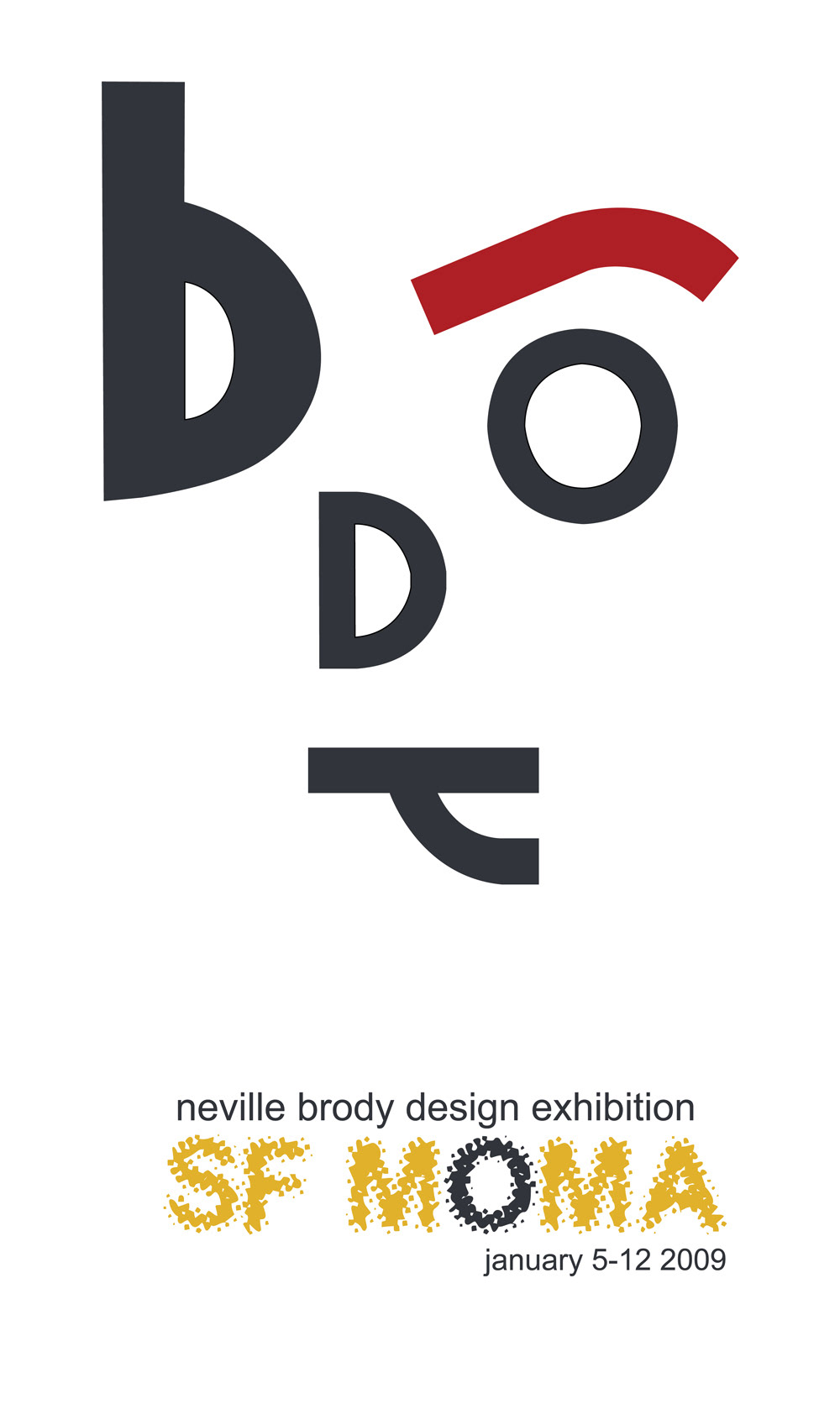
Neville Brody


Neville Brody could be seen as one of the most influential graphic designers of the late 20th Century. His work was so influential during the 1980's, it revolutionised the look of all modern magazines, album covers and advertisements. Brody was well known for his typography work, especially his ground-breaking design for the magazine 'The Face'. Driving factors of Brody's work were art movements such as Dada, Futurism and Constructivism. These types of design perspectives were influential to Brody and it is evident because you can see a mix of all three of these influences in his work.
Brody’s designs consist of very creative and different pieces of typography. Brody continues to break the visual boundaries and try to break new creative grounds, by doing this, he is also making a name for himself as one of the leading Graphic Designers in the world. He worked for "The Face' magazine from 1980 until 1993 where he gained a lot of attention and recognition to his work. He left in 1993 and created his own business called Neville Brody Studio, which is now called Research Studio. Research Studio has studios all around the world and has become a globally recognised brand.


In 1988, Brody designed an advertisement for Nike called "Just Bounce It" where he explored and practised new forms and methods of typography. He manipulated the colour, sizing and rotation of words which incorporated with the images involved in the advertisement. This new approach in design was sent to a large audience as Nike is a big company. By presenting this new technique to this large audience, Brody challenged design conventions for an entire generation of artists and challenged us as the consumers of these designs. He was sending a message telling us to reject old and conventional methods of design and get used to typography and experimental based designs. Effective typography isn't straight forward, it is experimental and crazy.
The album Micro-Phonies by Cabaret Voltaire is one of Brody's most influential pieces. The design was done by Brody in 1984, earlier on in his career before he became well known and seen as a influential artist, rather than non-commercial artist. His infamous typography, at the time, features on the covers stared 'blankly at the viewers'. This work was inspired from his interest in Dada styled design. We can see his personal style of typeface and typography and a bandaged character with liquid spouting from its mouth almost like a drip effect. He uses colour and symbols such as the cross to create an atmosphere where multiple messages are displayed. His messages relate to the content of the bands album and also have a deeper meaning which was a message to the rest of the music industry. This album cover was bold and designed very differently to other albums on shelves at the time.


Brody's style could be described as bold. His opinion was that people read magazines in a different manner from the way they read books. When people read books the read word for word, however for magazines, they tend to browse until they see something that catches their eye. We look for things such as colour, imagery or style to attract our attention in media such as magazines or advertisements. This is what Brody decided to use this as a basis for his design work. He highlights his work with different sized and coloured text with a wide variety of style and positioning which made certain messages and words stick out more than others. In his work we see that his style of lettering is used to illustrate the article just as much as the images do. He believed that text and images should both be used to create the same effect of visual impact.


Brody likes to challenge the eyes and minds of his design's viewers. He would change the appearance of certain words and messages in his designs specifically in his magazine The Face, where he steadily broke down the word contents as the magazine progressed. He broke it down until it was only a few marks on the final page but you would still know it said contents. He was able to do this with his own typeface which he created. His message was how clear does the word need to appear for his audience to recognise and understand it? His goal was to transform the word into a few geometrical shapes by the end without the viewer even noticing it changed.

Comparing and Contrasting David Carson and Neville Brody -
Similarities
Both of these designers made their initial mark in the 1990’s era. Because David Carson and Neville Brody both came from the same design generation, we can see many similarities within their artwork.
Style
Their style of graphic design is very similar due to their main focus on typography and the manipulation of text. They both have a unique style which differentiates themselves from each other, but overall their style of typography and photography are very similar.
Typography
Both designers are well known for their typographic work. They both use this aspect of design heavily and it is evident in mostly all of their creations. This text design, typography, is the way they communicate their ideas and main messages to their audience.
Composition
Both designers are extremely good at using composition and creating a well composed layout for each and every design. They both use a variety of text size, rotation and positioning which creates a pleasing visual atmosphere.
Colour Scheme
Carson and Brody both use a limited colour scheme and never exceed more than three colours in a graphic design piece. They both regularly use strong colours such as red, which is a bold colour and catches the eye. They both also use colours such as greys and tans which create that Dada design effect.
Photography
The use of images and photography is present in both Carson’s and Brody’s work. The designers use photography to work alongside the typography as a way of breaking up the text and tieing in the colour scheme. Both designers use portraits, often with no saturation (black and white).

Differences
Although they are both strong typographic designers, their work has slight variations which has been caused through their different perspectives on how the reader will understand their message. These slight differences have also been caused by the two designers having different inspirations...
Style
Carson: David Carson is a deconstructivist. Because he is a deconstructivist, Carson tends to break a lot of his work down. It is an art and architectural style influenced by deconstruction. It encourages radical freedom of form and the open manifestation of complexity in a design rather than strict attention to functional concerns and conventional design elements.
Brody: Neville Brody is a constructivist. Constructivism was primarily an art and architectural movement. It rejected the idea of art for art's' sake. Instead, it favored art as a practise directed towards social change or that would serve a social purpose.
Influences
Carson: David Carson is influenced by the environment. He is inspired by the world around him and is constantly taking photos and believe things he sees and experiences influence his work. Not directly, but indirectly in some shape or color or something that registers. Being a surfer, he ocean plays a big part in Carson’s life and designs. Anyone can buy the same programs and learn to do “reasonable and safe” designs, the life experiences is what makes a difference in Carson’s work.
Brody: Neville Brody is influenced by Constructivism design, Dada design and Futurism design. His consists of a strong mixture of these three graphic design influences. Neville Brody, who was born in 1957, grew up in an era where punk was at its peak. A lot of this would have helped influence Brody onto some of the work he has created today.
Typography
Carson: David Carson is the father of grunge typography. His typeface is messy and unorganised, but this is all a part of the design element. His typography focuses on the concept don’t mistake legibility for communication. His messages are always clear though his text seemed messy and cluttered. He often distorts his text in a way where it is still readable.
Brody: Neville Brody typography work is the opposite from David Carson. It is very organised and clean. In most cases, it is never seen over lapping and out of order as Carson’s is. Neville Brody also uses unique styles of text as he uses his own typeface on a regular basis. Brody also distorts his text, but he transforms his text over time into symbols and shapes, rather than still (barely) words.
Composition
Carson: David Carson layers his text on a regular basis. This enhances the grunge effect which signifies Carson’s style. David Carson layers his text and images creating a heavy atmosphere. He mixes his work up by switching up the size and rotation of his imagery and typography, enhancing the size of certain messages he wants to remain legible.
Brody: Neville Brody’s work for the most part remains very organised and neatly organised. He too uses a lot of composition with the way he arranges the size and rotation of his typeface. In his magazine The Face, we see his composition appear as very formal and well ordered.
Colour Scheme
Carson: David Carson doesn’t like to mix colours from different colour groups (i.e. if he is using purple, he will also use a cyan blue which contrasts really well with the colour purple). We see Carson use strong colours such as reds and yellows which draw and attract the human eye. He then layers these colours with white and black text, creating a bold presence.
Brody: Neville Brody’s work has a regular black and white tone to it. He accompanies this black and white colour scheme with black and white text also. This is where Brody introduces single colours such as red which makes a point of difference and makes the red text appear bold.
Photography
Carson: Being a deconstructivist, David Carson often breaks down his images. We see this in one of his magazines for Ray Gun, where he used a image of someone’s eye. He removed most of the person’s face and broke the image down so only the eye was focused on. He uses repetition and composition with his images, repeating it and varying the sizes of the duplicates.
Brody: Neville Brody quite often uses portraits coloured in black and white. He prefers close up shots, rather than zoomed out portraits, which are large and take up a lot of room. He works around these large grey scaled images with his typography and symbols
Symbolism
Carson: David Carson rarely uses symbols in his work, his messages are usually received through distorted text. He uses patterns as small aesthetic backgrounds, but barely uses symbols to get his ideas across.
Brody: Neville Brody uses symbols all the time to keep the viewer challenged and thinking. He transforms words into symbols overtime so creatively that his audience still understand what the symbols are representing. We see this in one of his magazines The Face.


